Gorgeous Charts Make Us Lazy
Charts today are gorgeous, it’s really something to behold. And looking at another gorgeous chart recently I changed my mind on the value of beautiful charts. I’ve been pretty positive, “communicate your data and the resulting conclusions more clearly!” I would think. Now I see a burden that places the aesthetics over the meaning. Complicated tool sets that encourage regular people to nod along as opposed to digging into the data.
It doesn’t have to be that way, but like certain other tools, I think too often the nuance in the data is getting lost, and the rigidity of the tools means you can have less of it in general. No one wants ugly charts when you can have gorgeous d3 dashboards. Dashboards that more often than not require command line tools and python or js, or expensive subscriptions.
I’ve been playing with sketchy charts recently as an alternative, and it feels better. Like the below, made with the lovely Excalidraw,

But it’s still pretty, just in a different kind of pretty. What I really want are punk rock charts. Charts that scream, “Fuck you if you wanted me to be beautiful.”
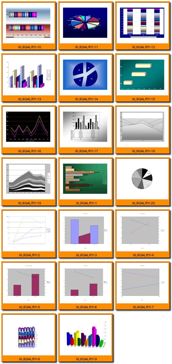
Today, dear reader, I think I found my punk rock charts. They were hiding in Excel 2003 all this time. It’s time they made a comeback.
Editor’s Note: This post was originally titled “Gorgeous charts make us stupid”. Lazy better captures my sentiment.